Fresh Fare Farms Multichannel Campaign
Social Media and Marketing, Layout and Publication, Motion Graphics, Illustrations and Icons, Multi-channel Ad Campaign

Project Overview: Fresh Fare Farms Multichannel Campaign
This project was completed as part of my BA in Graphic Design and Media Arts, with a concentration in Web Design curriculum. It demonstrates my ability to meet specific project briefs, adhere to deadlines, and apply design theory to simulated or real-world client scenarios.
Role: Brand Strategist & Multimedia Designer
Tools: Adobe Illustrator, Photoshop, InDesign
Deliverables: Brand Mood Board, Magazine Advertisement, Instagram Carousel, and Animated GIF Ad
The Challenge
The goal was to position Fresh Fare Farms as a socially responsible, sustainable meal-prep solution for a younger, eco-conscious demographic. The campaign needed to tackle three distinct objectives: attracting a new audience, educating consumers on sustainable food, and raising awareness for community food insecurity.
The Strategy: Building a Cohesive Brand DNA
1. Visual Research & Mood Board
The foundation of the campaign began with extensive visual market research.
Competitive Analysis: I analyzed competitors like Hello Fresh and Sun Basket, noting a lack of diversity in their imagery.
Creative Pivot: To differentiate the brand, I focused on a "vibrant citrus" palette—avocado green, lime yellow, and carrot coral—to establish an identity that is both eco-conscious and high-energy.
Visual Language: I integrated organic, fluid shapes and rounded rectangles to ensure the brand felt approachable rather than clinical.
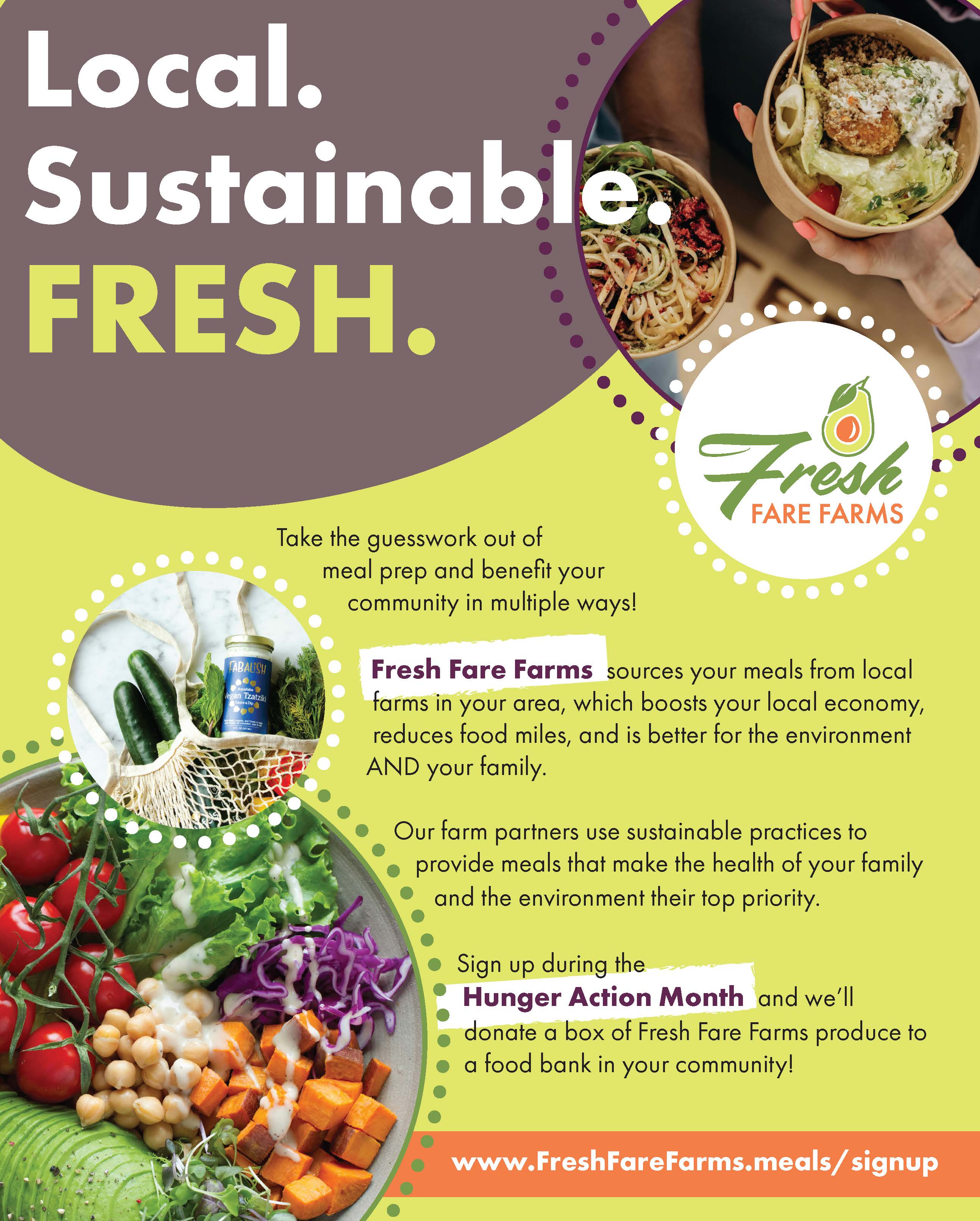
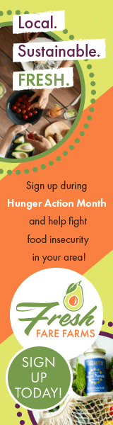
2. Print Media: Magazine Advertisement
The magazine ad was designed to balance dense information with high-impact visuals for busy "internet multitaskers".
Hierarchy: I utilized a bold headline, "Local. Sustainable. FRESH.", to immediately signal brand values.
Scannability: Body copy was broken into digestible chunks to acknowledge the time-sensitive nature of the target demographic.
Modern Accents: I implemented round dotted frames as playful, organic elements to modernize the ad without competing with the photography.
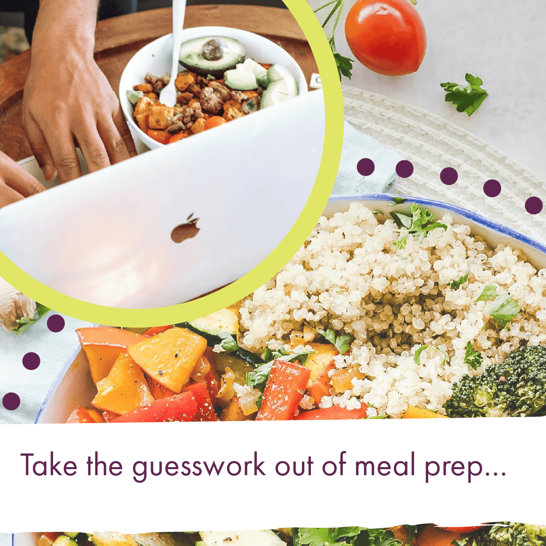
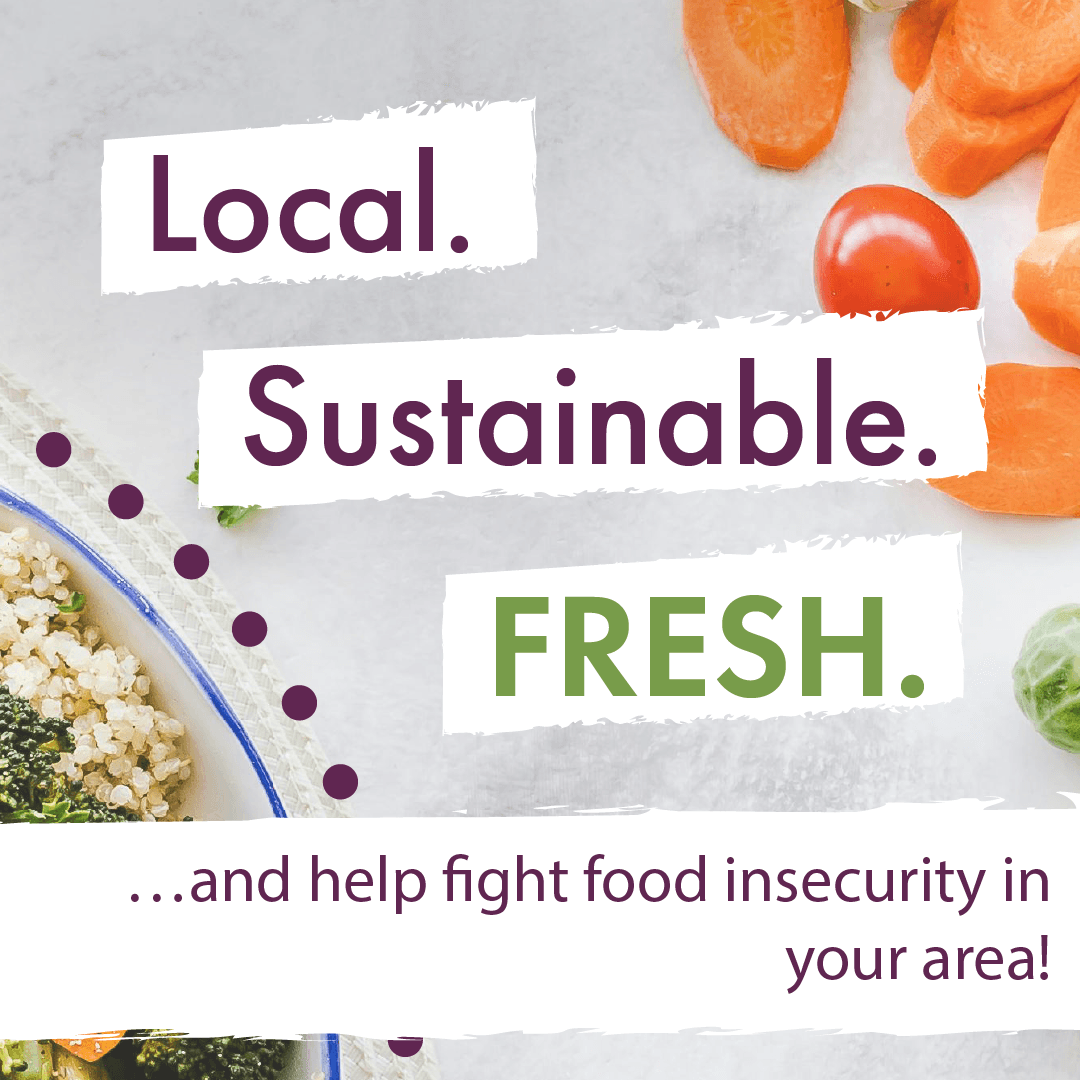
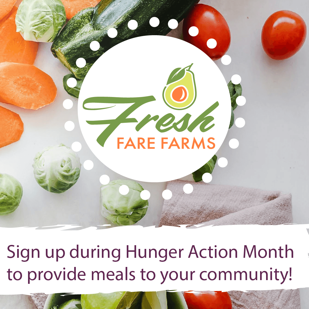
3. Social Media: Instagram Carousel & GIF
To bridge the gap between static print and dynamic digital, I adapted the campaign for social platforms.
Storytelling: The Instagram carousel used a "problem/solution" flow, starting with "Take the guesswork out of meal prep..." and ending with a community-focused call to action.
Motion Design: The animated GIF was designed to stop the "scroll" by using high-contrast colors and movement to highlight Hunger Action Month.
Key Technical Achievements
Consistent Brand Identity: I ensured cohesiveness across all deliverables by repeating core elements: the "Rule of 3s" in typography, authentic diverse imagery, and a consistent color nomenclature.
Design Justification: Every creative choice was backed by design principles like balance and contrast to ensure the brand appeared as a reliable, socially responsible leader.
Accessibility & Diversity: Unlike many competitors, this campaign intentionally featured diverse foods and people to resonate more deeply with a broader, modern audience.
The Result
This project showcases my ability to manage a complex, integrated campaign from conception to completion. It proves I can maintain a unified brand voice across vastly different formats—ensuring that whether a customer sees a magazine ad or a 3-second GIF, the "Fresh Fare Farms" identity is instantly recognizable and trust-inspiring.